Button
Lets the user take an action (this could change the state of the current page or navigate the user to a different page)
Code component(s): Button
Buttons are used to signal to the user that they can take an action. Unlike Link, buttons are not meant to be used inline. And unlike Icon Button, buttons include text.
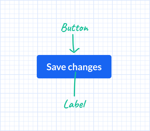
Anatomy
Options
Label
Specify the text that explains to the user what will happen when they click/tap on the button
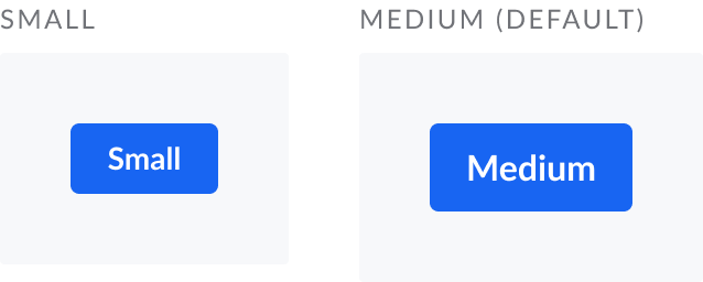
Size
Choose between Small (32 px tall) or Medium (40 px tall, default)
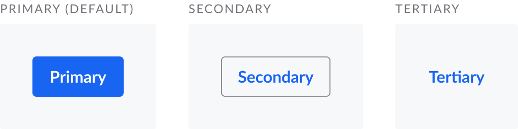
Variant
Choose between Primary (default), Secondary, or Tertiary
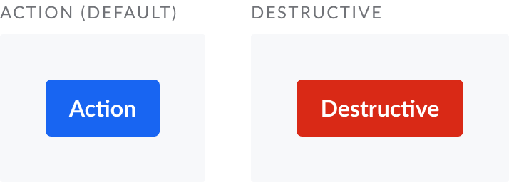
Color
Choose between Action (default) or Destructive
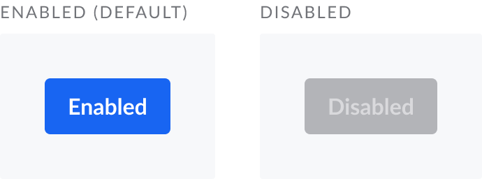
Disabled
In some circumstances you may want to temporarily prevent the user from taking an action, yet still show them that the action may be valid in a different state
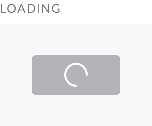
Loading
In some cicumstances you may want to indicate that an action that requires more than a moment of processing time is being taken. This option is only available for the Primary button style.
Width
Specify if/how this component resizes horizontally
Guidelines
Stack buttons horizontally (or vertically on phones)
When you provide multiple related actions, stack them horizontally with 16 px of space between them. For phone form factors, prefer vertically stacking since horizontal space may be limited.
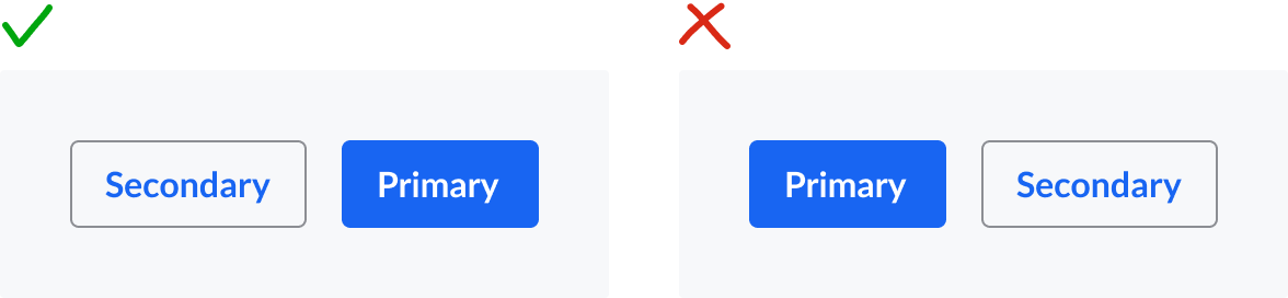
Place default actions to the right (or below on phones)
When you provide multiple related actions, place the button for the default (ie, most commonly expected) action to the very right. On phone form factors, place the default action at the bottom of the stack.
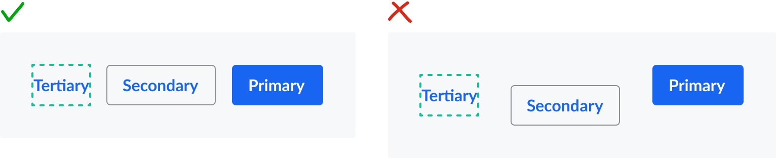
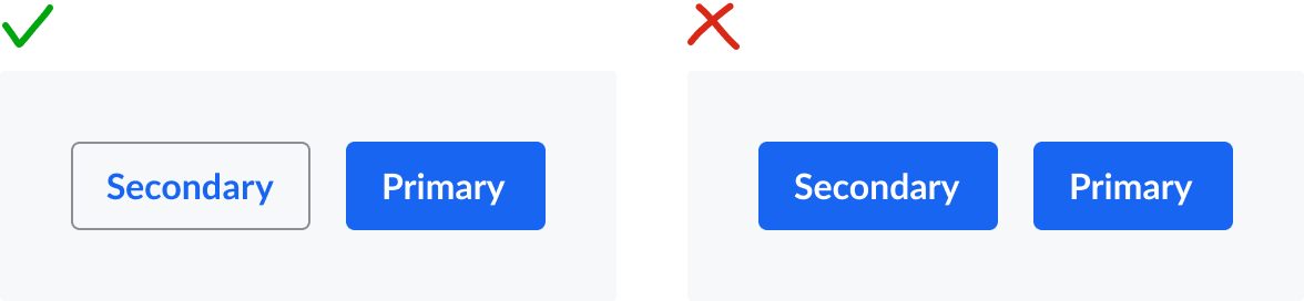
Only use one primary button per screen
The primary button styling can be visually overpowering, so use it sparingly to call attention to the main action the user needs to take on the screen
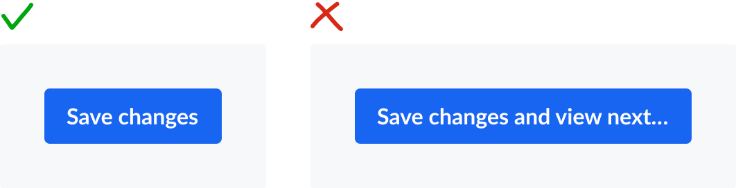
Keep labels concise
Keep labels concise so they’re fully visible across form factors and languages