Modal
Presents a short, secondary flow in a dialog that floats above the primary flow. The secondary flow must be dismissed or completed before the user can return to the primary flow.
Code component(s): Modal
Modals should be used sparingly because they restrict access to information and controls on the primary screen. Try to use the primary screen for flows and interactions whenever possible. Modals consist of a dialog (for secondary flow) and a backdrop (which covers and prevents the user from interacting with the primary flow). Use them for short flows that wouldn’t warrant a whole new screen and relate strongly to the content on the screens they appear above.
Anatomy

Options
The following options apply specifically to the dialog (the backdrop is not configurable and always fills the entire screen), but it’s recommended to use the existing dialog layout patterns below when possible. The dialog is always positioned in the center of the screen.
Click/tap outside to dismiss
If this is enabled, clicking or tapping outside the dialog (ie, on the backdrop) will dismiss the dialog
Background
The background color of the dialog can be adjusted, but we recommend using white
Content
You can provide any content you’d like, including interactive elements
Size
Specify if/how this component resizes horizontally and vertically. See the guidelines below for more details.
Patterns
While you can lay out your dialogs however you’d like, we recommend using one of the following layout patterns if possible. The dismiss button on the top right of these patterns can be optionally omitted if you provide an alternate way of completing or dismissing the modal.
One-Pane Dialog
A simple layout for modal experiences where you need to collect information from the user. You can swap out the header and footer for alternate versions (see Sub-components below), and you can customize the content. The width is fixed (ie, based on the viewport width), so plan for two columns of content that reflow to a single column on narrower screens. The default height is 674 px, but it can be overridden.

Sub-components
These components are designed to work with the patterns above, but can be used piecemeal if need be in your custom dialog designs.
Dialog Header
The header is meant to serve as a wayfinding and navigational element in your dialogs. There are four elements within the header: Dismiss button (optional as long as you provide another way of dismissing or completing the modal), title (required), subtitle (optional), and breadcrumb (optional). You may not simultaneously show a subtitle and breadcrumb. Each of these come with variants for small screen sizes (see the Figma library for details).

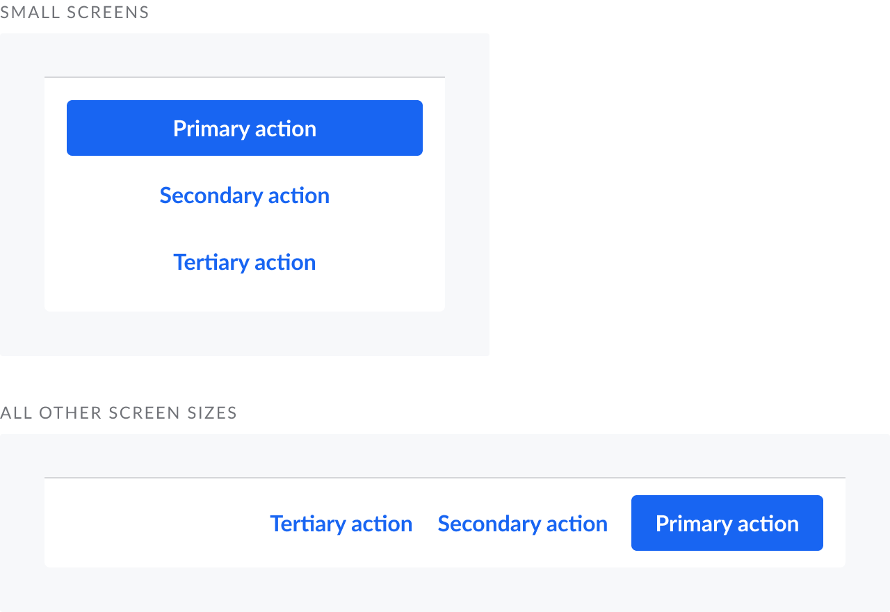
Dialog Footer
The footer is meant to be the primary navigational element between steps within your modal flow. Align elements to the end (for primary controls) and beginning (secondary controls)
Guidelines
Give your dialog margins
Always leave at least 16 px of space between each edge of the screen and the dialog

Content should be scrollable
When the content of your dialog is taller than the amount of vertical space available, allow the user to scroll the contents of your dialog

Related components

